Brand Standards
The following graphic standards have been established to create an effective brand identity for WoodmenLife. By using our logo and name consistently and accurately, we increase recognition and awareness of WoodmenLife. We also reinforce our commitment to high standards of quality and service.
The Logo
|
Primary Usage  |
The primary WoodmenLife logo is composed of the tower symbol and company name. The service mark location is always on the top right of word mark. This is the default logo, go-to version. |
| Tower Symbol Usage
|
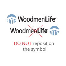
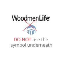
The tower symbol should only be used when WoodmenLife word mark is visible or has been clearly branded elsewhere. The tower symbol is to be used as a design element. |
Logo With Tagline and Web Address
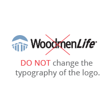
The logo may also be used with the company web address. The logo is not to be typeset.

Logo Color
When the logo appears on a white background, use our primary Tower symbol blue PMS 645 C and black logo.
On a dark background, use an all-white logo, and if the logo appears on a light-colored background, use the all-black logo.
Tower Symbol Blue
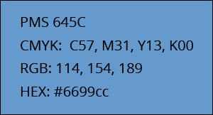
Full Color Usage

Approved color combinations


Not Approved color combinations


Clearance
Always maintain clear space around the logo to protect it from distracting graphics or typography. For the signature, measure clear space by the height of the “W” in WoodmenLife for vertical space, and the width of the “W” for horizontal.
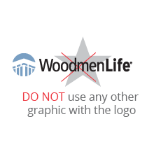
Never allow typography or other elements to “invade” the signature or the symbol. When using the logo only, the clear area on all sides should be equal to the height of the W. The logo should never be used as part of a sentence or text slogan.
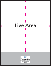
Maintain clear area around signature.
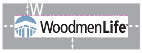
Clear area must equal height of letter “W” in logo around signature.
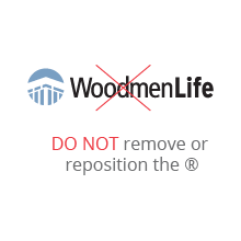
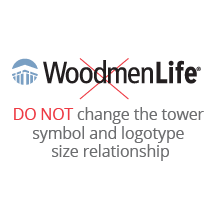
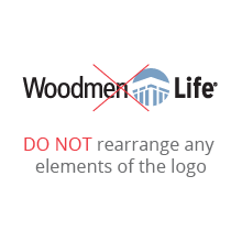
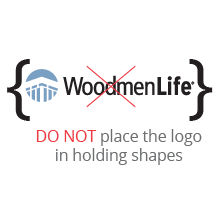
Improper Usage
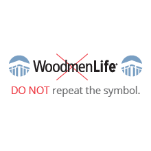
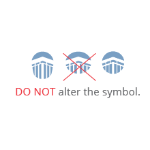
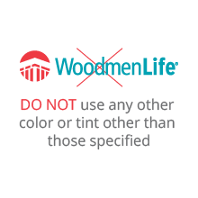
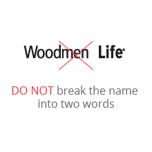
The logo is the primary visual representation of the brand, and needs to be treated respectfully. Changing any part of the logo will jeopardize consistency and weaken its impact.
Please avoid doing the following:
